
Hi all,
I am curious to see what you do to present your artworks in an appealing way.
I was in two minds whether or not I should post this topic under “Share Your Art” category.
Well, I am showing some of my artworks, but it is not the main focus of this topic, so I chose “Uncategorized”.
I myself usually use my own templates which I prepared by combining some copyright free photo materials and frames developed using a computer graphics software. But I hear that there is a framing application, by which you can easily produce scenes where your artworks are used as framed wall décor. I have been looking for the application, but somehow I cannot find it. I suspect if it might be a smartphone specific application. I am much more a PC person, rather than a smartphone person, so hopefully I would like to find a PC application.
Also, I would like to know if there are any courses within VI which deal with this particular topic.
While I watch the member’s minute episodes, I often see Matt correcting the photos of the original artworks using photoshop, but I always scan my works with a very high resolution level, and fine-tune the digital images comparing the data to the originals. So this sort of photo-correction is not necessary for me. What I want to know is more about how to effectively appeal your artworks, giving the viewers a very clear image of how your artworks will make their places look lovely.
Anyways, I share some of the templates I currently use.

The title of this work is “dune”. One of my earlier abstract works and this shows the impression I had while I was photo shooting in a desert in Vietnam. Since the image is pretty colorful, I chose a simple and bright background to bring out the image effectively.

This is “pure blue”, another initial abstract work where I just wanted to see what I could do with only blue and white. I wanted the blue color(to be exact, this particular blue is called Ultra Marine Deep) stand out in the scene, so I chose whitish coloring in the background.
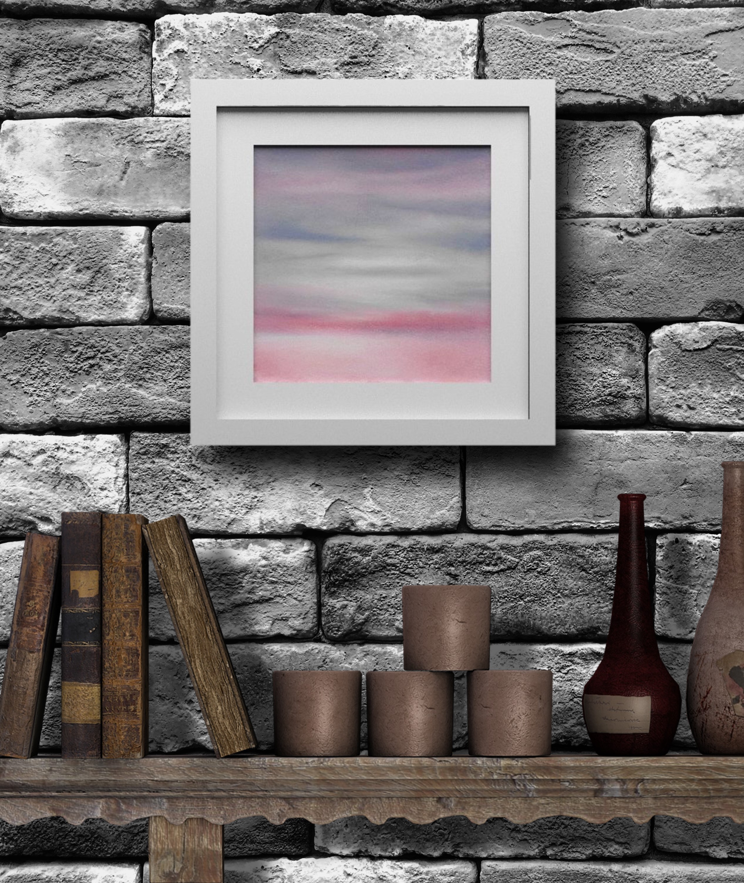
This is “betwixt and between”. My production note of this work reads:
I wonder if the sun will appear out of the heavy clouds if I wait for a while or the clouds will get heavier and hide the sun completely and I will have no chance to see the sun at all?
This is a situation we face just so often in life, but maybe we should give up the habit of seeking for the highlights alone.
Otherwise we lose sight of the richness of what is given due to our biased view.
The combination of pink and grey makes a somewhat ennui feeling, so whitish or bright coloring in the background will make everything look too quiet. So I chose darker coloring in the background for this one.

“swimming in the ocean of colours”, which illustrates my pastel classmates, me, and my pastel teacher enjoying swimming in the ocean of the colours of pastels. I came up with this image when thinking about how surprised I was to see the colourfulness of my first pastel set.
Again, this is also filled with bright colours, so I used very white background.

This shows the most recent pastel works, all of which are to be included in my next film.
Cats play a very important role in the film so I added a cat in the scene, but I suspect I could perhaps use this template for other works too.
If you have:
- any idea about the framing application
- any idea about the VI course dealing with this sort of subject
- any photo using your own works like the samples I shared here
please share it!
 …that’ s it!