
Hello friends. This is only my second share. Soft pastel peaches on Canson Mi-Teintes paper. I struggled a bit with the shadows (I had applied too much pastel and couldn’t apply additional layers - so I had to brush some off and start over so the shadows aren’t very nice). I had never done a pastel drawing before (except for one of Matt’s lessons) so I am happy with this one even if I can see all the areas that need improvement. Still learning!

16 Likes
Hello Patricia, thank you for sharing your lovely pastel drawing. I’m amazed at how elegant it becomes when you combine grey-purple background and orange objects. You may not like the cast shadow, but to me, it looks really well-done, because it is so natural. Not too dark, not too light, furthermore, the texture within the cast shadow appears to indicate the texture of the place where the pears are put. I love it because it is not flat but has some nuance. The arrangement of orange with a different level of intensity of the pears looks very natural and convincing as well. I don’t know how you did that, but I can feel the texture of the surface of the pears very clearly. The only thing I would try to improve is the edge of the pears. I would make the edge of the pears more clear-cut by using a pastel pencil or a colour shaper so that the pears would have a solid presence. Hope you see what I mean by looking at this digitally-edited version of your drawing.

Blue circles indicate the places I particularly wanted to change.
I’ve also made the upper left part of the background of the left pear darker for the same purpose.
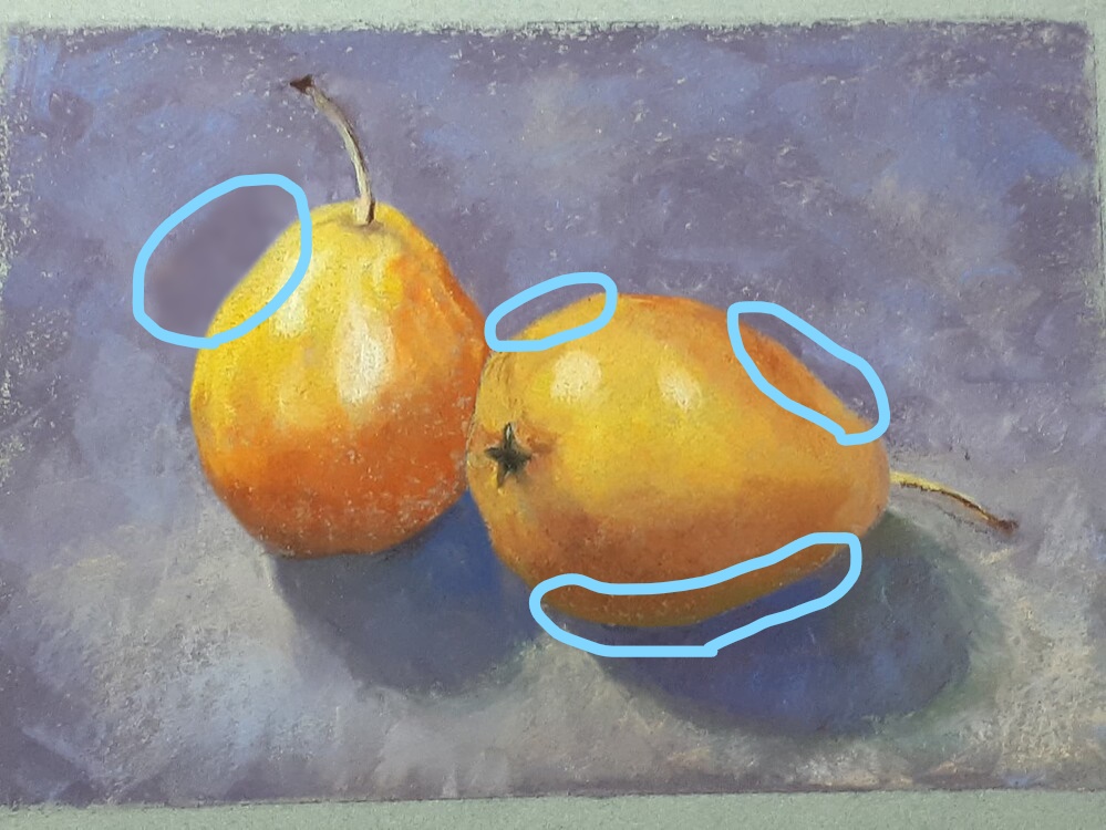
Overall, I really love this drawing for its elegance. I’ve once taken regular classical ballet lessons before and while I was a ballet student, I became a huge fan of Sylvie Guillem. I bought a BBC documentary video covering her life, watched it many, many times, and I sometimes remember what she was talking about her approaches to dance. In one of her interviews, she used a French term “superflue”, and rephrased it like “I take away all the gesture that doesn’t mean anything.” I think this idea applies to other forms of art too. This artwork strikes me as being very elegant thanks to its “superflue”-less nature.
1 Like
Thank you so much for your wonderful feedback and suggestions. I agree with your assessment of the pears edges. If I have a chance, I will try those improvements. I particularly appreciate your parallel with Sylvie Guillem’s statement.
I submitted this to Matt for the critique but I am not sure that this would meet his requirements for the members’ minute (it’s only the second one I have sumitted). Right now I haven’t been doing much art because my mother-in-law has been in the hospital and, after a stay in the hospital, her health continues to decline so it doesn’t leave me much uninterrupted time or energy for myself (she’s 100 and lives with us). By the way, congratulations on yet another critique from Matt. I think he is in love with your art (and rightfully so!). Thanks again.
2 Likes
This is great.You did a great job. Never stop learning. Keep up the good work
1 Like
Thank you Denise. Pastels are quickly becoming my favorite medium.
1 Like
Thank you so much for your response despite the difficult circumstances you are in right now. I know how it feels because my mother, who was almost fully recovering from her compressed fracture which took place in Feb last year, next had a cerebral lacunar infarction in the last Dec. She had to go through a hospitalization again for about a month and then an intensive rehabilitation at a Geriatric Health Services Facility for a couple of months. She came back home in Apr this year, but her health is not as good as it used to be, and I am her primary care giver. So I think I understand what you mean by “it doesn’t leave me much uninterrupted time”, although I still have much energy to work on artistic activities because I make it a rule to take 7 hours of sleep everyday to protect my own health. Anyways, take care, I look forward to watching the critique episode featuring this marvelous pastel drawing. And thank you so much for your kind words about my recent episode! ![]()
![]()
![]()
1 Like
Thank you for your message. Let’s keep creating! ![]()
![]()
![]()
1 Like
Hi Patricia,
What a lovely pastel painting! I love the pears’ 3D and your choice of background. Great colours and texture. So glad you shared this with us. Thanks!
Thank you very much for your comment! Next one might be from the animal world…
Oh! That’s sounds great! Looking forward to seeing it. Happy painting or drawing! ![]()
And happy painting and drawing to you too!
Patricia,
So painterly, beautifully done. Thank you for sharing your artwork as well as your experiencing. It is encouraging to those of us who are starting out in pastels as well as any other medium.
Maki, your reviews and critiques are always so helpful, not just for the artist sharing their artwork but for those of us on the forum who are also learning.
Again, very nice job!
Teri
1 Like
Thank you very much for your kind comments.
Maki,
I learn so much from your descriptive way of expressing your suggestions on anyone’s piece of artwork. Always encouraging and helpful
Teri
1 Like
I love your pears. When I look at it the pears almost look like they are stuck to the page. I might suggest that you put a bit of a shadown where you have circle areas in blue. I think you might be seeing what I am talking about. Darker on the bottom of the pear (in front) so that when you are looking at the actual shadow it will look more like it is sitting on a table. The pears on the bottom are too much the same tone, so they don’t look like they are more dimentinal. Maybe sharpen up the edges of them. Especially on that line separating the two pears.
Maybe make the purple color behind he pears a little darker so the line of the pear would be more pronounced. I think this would make the pears look as if they were on a table.
You’ve done a great job here. I’m hoping to get back into my art. I’ve been going to PT for my broke kneecap and balance.
Take care
Lenora Andre
Hi Lenora,
Thanks for the feedback and suggestions. I will keep those in mind. I will probably not revisit this particular painting as it was done on Canson Mi-Teintes and I had pretty much used most of the tooth in some areas. Every time we create something, we learn where we can improve and can apply it to the next attempt. Take care of yourself.