
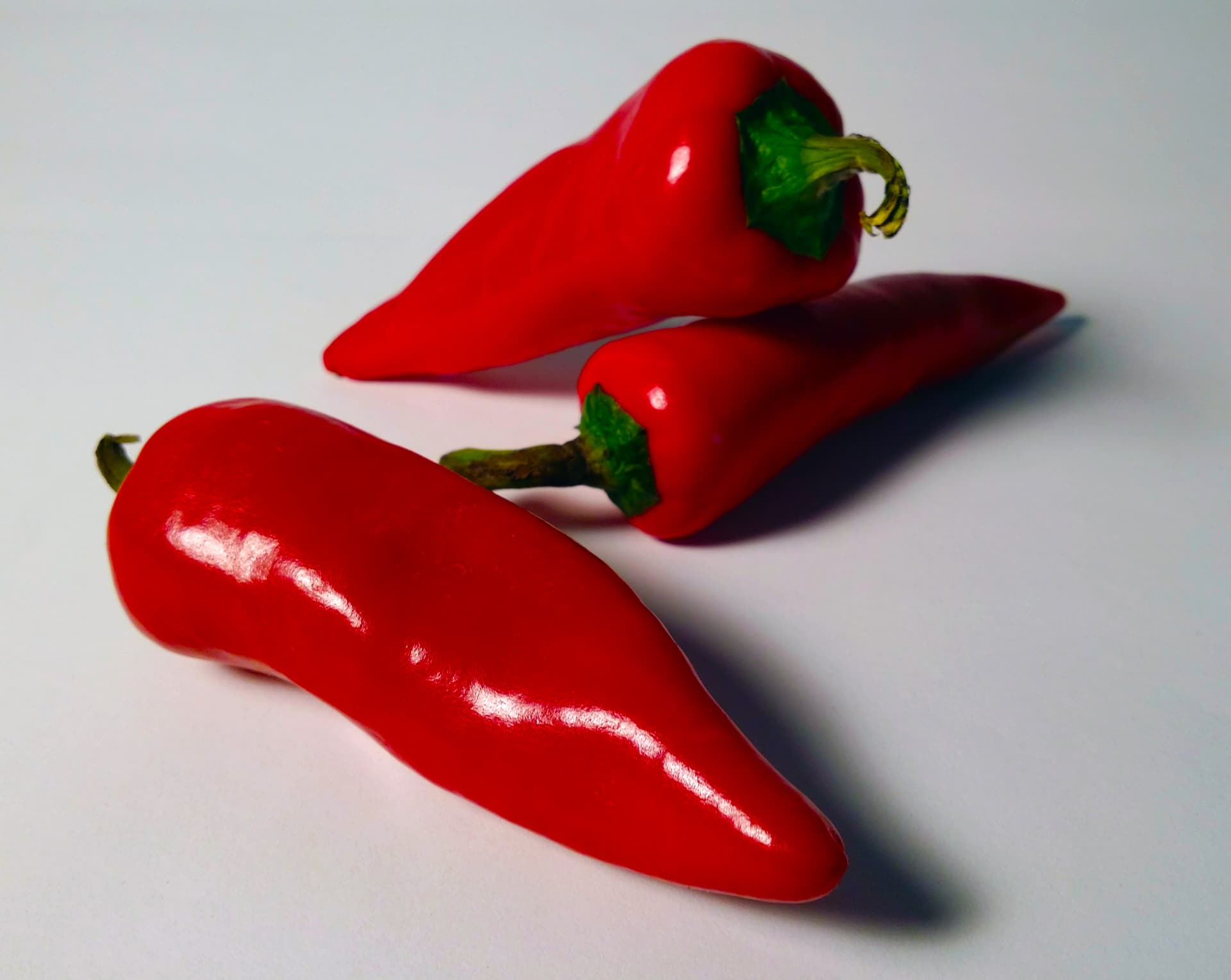
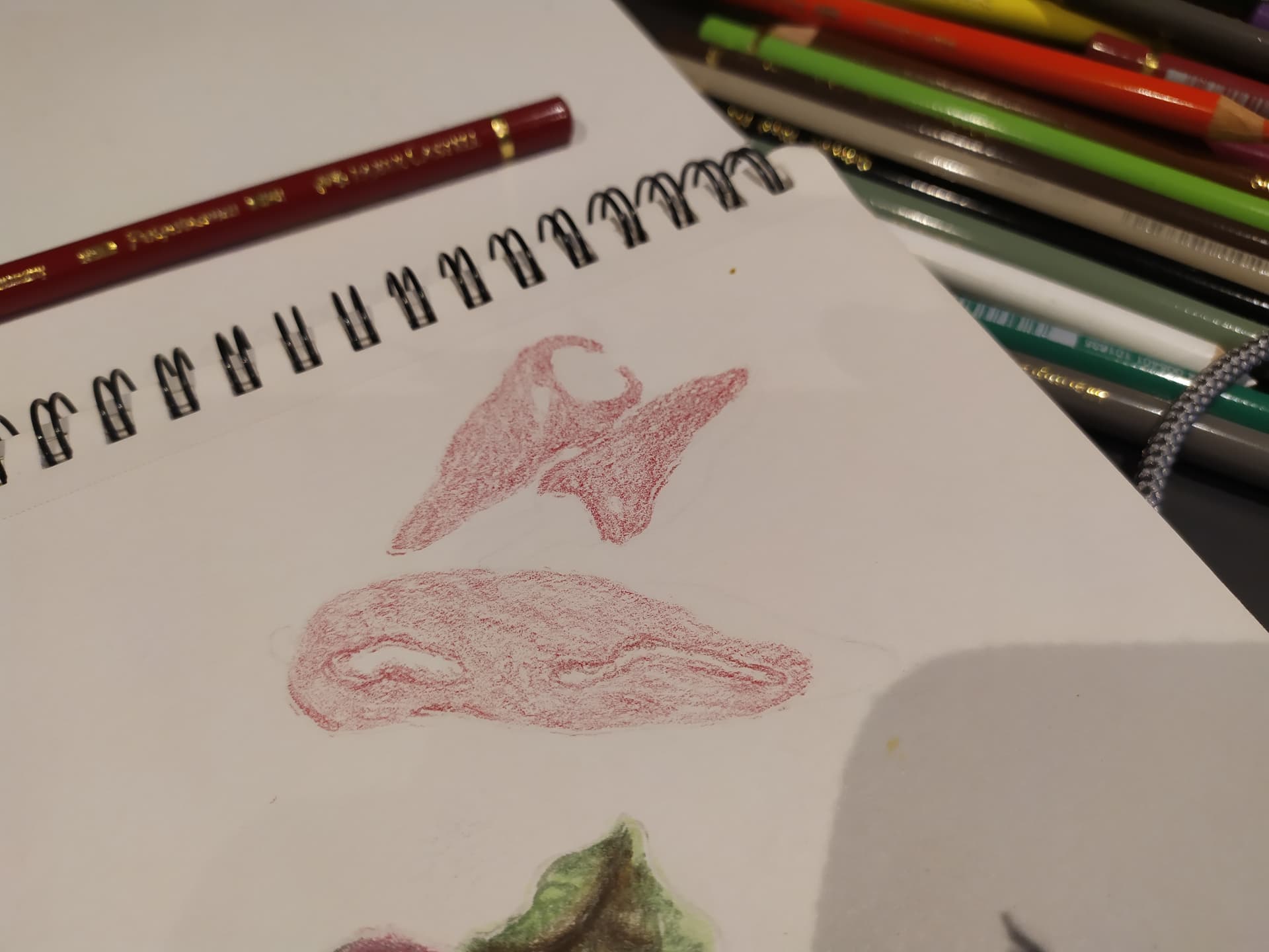
Hi everyone, I tried the red pepper drawing from the coloured pencil course and similar to my previous post about the macaroon drawing I tried, I think it ended up looking bad/not realistic at all. I wanted to ask if anyone can share some advice on how I can improve?

3 Likes
@jp101 the first thing is to be friendly to yourself! I know how strong self critic can be… my advice is to follow Matt through the course and look with some humor on your pictures…. We are all in a learning process and hand eye coordination is a big training.
And recognise: Matt is the teacher he has to show us good results… maybe he draw the peppers two or three times until he showed them in the video… and for us it would be a nice experience as well to draw some piece more then one time.
OMG… this is more a philosophy then a art advice😅… I am learning every day much about drawing and during this much about myself.
4 Likes
Hi @jp101
When you’re working with colored pencils the answer is either the paper you’re using, the quality of the colored pencils, or most often you just haven’t added enough layers yet. I think that’s your problem because I can see the white of the paper showing through. And if you don’t have enough layers, you won’t be able to blend to get the look of realism.
My suggestion is to treat yourself to some PastelMat paper. It is one of the best for colored pencils. And it will require that you keep adding the layers. Hope this helps. It takes a while to get the feel of it. I think your drawing is just not done yet. More layers. And let us know how that worked for you.
Terri
3 Likes
Thanks Terri! I was using Strathmore Coloured Pencil paper, I don’t think it is as heavy as vellum paper so perhaps that’s why I feel like I’m struggling to get many layers down. It felt like after three layers on the peppers I couldn’t really add any more. I did notice the white of the paper was still showing though, even though I had tried to burnish. I’ll look into other paper options.
1 Like
Yes, not all papers will accept enough layers. Many people think when starting that they’ll just use the least expensive supplies until they get the hang of it. So it becomes an uphill battle because of the supplies. Keep letting us know how it goes and if you need more help figuring it out.
Terri
Thanks Terri, will do! I don’t even think the paper I used is that cheap, it’s roughly the same price as the Strathmore Vellum paper which I’m thinking of trying..
1 Like
I like the pepper furthest from the viewer best; I think you’re on to it. It may help you to rotate the reference and your paper as you draw what you see, especially if your observation gets tired/weary. Sometimes, we need to forget that it’s a pepper, and just look at the colors and the value and the lines we see.
Try to just see the areas of color in reference to one another. For instance, focus only on the white spaces in the biggest pepper. What shape is it? and compare to your drawing, and adjust by adding more layers as Terri suggested.
Best advice I’ve ever gotten in drawing was my from my big brother when I was young, to draw what you see, not what you think.
2 Likes
Hi,
I think I see Faber Castell Polychromos in the picture here. They are champions of the layering process. THey easily go to 18 layers on the right kind of paper. I would suggest a smooth paper for those pencils. Personally I like Clairefontaine Paint On smooth surface for these pencils or Strathmore Bristol Smooth 400 serie. Do not get a paper that is less than 250 gsm. You can also consider buying a small set of Prismacolours or Caran d’ache Luminance. They are both wax based colour pencils and will perform very differently, they blend easier and you won’t have as much issue with graininess. If you are based in Europe just know that Prismas are difficult to come buy and they won’t be available as singles any more. Another reaaly good wax based pencil is Derwent Chromaflow.
3 Likes
Thanks, yes they are Polychromos. I just discovered the paper I’m using is only 163 gsm so I am thinking of getting some bristol vellum instead. How much impact does it have on the ability to layer and mix colours if you draw on 270 gsm paper compared to drawing on 163 gsm paper?
I am based in the UK..
1 Like
Hi Jay.
The weight of the paper has a huge impact. And so does the surface of the paper. I have some Strathmore Bristol Vellum 270gsm and my Polychromos works great on that paper. That paper also handles lifting and the knife technique excellently. I wouldn’t use solvent on it - I would recommend a hot pressed watercolour paper like Arches for working with solvent.
Thanks siffermus, appreciate the info, I’ll try that kind, hopefully that will help me improve at least a little bit…
What do you mean when you say “lifting”?
Hi Jay,
Lifting is how well erasers can lift the colour of the paper - and this paper responds well to all the erasers, tombow mono, kneadable, electric and regular ones. This is a drawing of mine using Polychromos and Derwent Lightfast pencils on Vellum paper

2 Likes
Hello Jay,
I have used the Strathmore 400 series colored paper and it actually has quite a bit of tooth. Took me multiple layers to cover this paper and turns out real nice.
Like Terri said, you most likely need more layers of color and blending. And also as Elina said, don’t be too hard on yourself. Matt says practice, practice, practice and in my case he is correct!
It doesn’t look bad as you think it does. For starting you are off to a good start.
Teri
Thanks for sharing your thoughts Teri! Do you notice a difference between the colored paper and a paper with a vellum surface? I’m trying to understand if the heavier weight of the vellum surface makes a big difference in being able to layer and mix colours. I felt like after ~3 layers it became very difficult to get any more layers down, almost like the surface had glazed over. I suspect I am doing something incorrectly if you are able to make it work ok!
Hello Jay,
It depends on the subject the medium. and what you are wanting to arrive at.
For example I am going through the oil pastel course. For the last module it is a colorful portrait. I did not have the same color that Matt used in the paper he suggested so asked him and Ashley and of what I had Matt suggested the goldenrod.
Due to the color it looks like an abstract painting or a poor attempt at doing a Picasso style portrait. Not like his though, at all.
So just know that whatever color choose it will enhance what you are working on. Personally I enjoy working on toned papers, but it is not always the wisest decision.
I hope this is helpful.
Teri (with 1r)
1 Like