【update Feb 22 '22】
Two additional works are complete!
I had only one week to spend for the entire collection of this series. Most of them are digital modifications of my original ballpoint pen drawings, so they did not take me so much time to finish. But I also wanted to add some totally new abstract-ish pieces. I was able to create only two works in two days!
Here are the finished works:
I have not decided the title of this piece yet. Something like “places I want to revisit”, because this piece shows the impression I got when I visited some very interesting places including Vietnam, Tunisia, Madagascar, and Egypt.
The local gallery I’ve been working with for the recent few years decided to launch an art subscription service. The gallery manager asked me to join the team, which offer I accepted with pleasure and I have been thinking about what kind of artworks will work well in this business.
Art subscription service is not a totally new business in Japan. There is one well-known company in this arena so I checked their website to see what kind of drawings/paintings are strong in winning orders.
Their answer to this question was very simple.
“People prefer something bright as wall décors.”
Most of my recent drawings are by no means “bright” because I’ve been focusing on ball-point pen drawings, all of which are black-and white. So I tried thinking about how I could make my darkish pen drawings brighter. I thought that one possible approach would be a digital arrangement of the original black-and-white drawings.
Here are the results so far.
Don’t you think they are indeed bright and cheerful, well, at least brightish?
I would appreciate it if you could let me know which one is your cup of tea
Hello Maki,
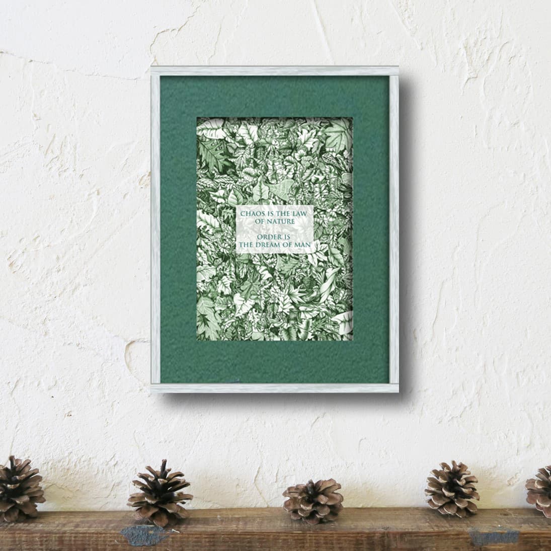
My favorite is the kitten in the yellow flowers. But, I like them all in varying degrees, so here goes my rating: 1) Kitten yellow flowers; 2) Black cat with pink flowers and green border; 3) Black cat… with pink border; 4) Chaos is the law of nature; 5) Keep a green tree… Good luck with your future projects.
Patricia.
My favorite is the kitten in between the wreath too. I love them all. It is great that the gallery offered you a job. Congratulations. Have you been showing you art work in the gallery or are you an employee there? You did a great job with these.
Hi Patricia, thank you so much for such a quick response! When you posted your reply, I noticed that immediately thanks to the incoming notification email. But I had only two days left to complete some other works in this series, so I had to keep working on them. Anyways, glad to know that you like them all. I expected that the kitten in the mimosa wreath would obtain much popularity. What is interesting about this is that I myself, the creator of this image, don’t know why. I still haven’t shared all of them with the gallery so I don’t know which one(s) they will choose for the rental service. But I am pretty sure that they will pick up the kitten-mimosa piece. Thank you for your kind words!
Hi Denise, thank you so much for letting me know your favourite! I feel happy to see that you love them all. I hope the gallery people will like them too! Yes, I had my shows at the gallery two times last year. They are also selling my products throughout the year even when they have shows of some other artists.
I think that the Mimosa wreath works because of the color combination, the wreath itself also conveys a kind of explosion of light tempered by the green and it brings the focus on the kitten as well. For me, yellow and green are very important colors - they represent the sun and plants that are vital to our existence. Let us know how things work out.
Hi Patricia, thank you so much for the clarification. It makes so much sense!
May I have your permission to share your comment on my fb/instagram/personal blog/online shop page?
Good to see you are expanding from the kittens to other subjects. I like the green leaves with green mat. Secondly, I like the blue birds and trees in blue with the blue mat. I like the black cat with the pink mat, Like the hour glass. See the hour glass first and if you look at the negative spaces I see a young girl with double ponytails and a smile on her face. I like all of them, but these are the ones I like best, in order. I guess I am very aware of mat colors. I always like to pull a color out from some color in the picture. The hour glass, I think would look very good in a double or triple mat with the white showing on a diagonal cut. But the closest mat to the picture cut on a straight edge, I think it would pick up the white in the drawing and a black frame. I also double or triple mat after spraying the work with a permanent fixative so that the glass in the frame won’t touch the subject in the drawing and pull it off. While I am still working on the drawing I will use a light dusting or workable fixative between layers so that I don’t have a lap-full of dust (especially working with pastels). When I mat my pastels and other paintings I always make the bottom part of the matter just a bit wider than the other 3 sides. Optical illusion that makes the mat look the same all around especially if it is going into a room where you would be mostly sitting down. Example if the 3 ‘sides’ top and both sides) are 3 inches, I will cut the bottom 3-and-a-1/4-inches wider. I learned that in private lessons when I started framing my work. Of course, that was over 50-years ago. I know when I took lessons as an adult we were told to put them in a white mat with all 4 sides equal especially if showing it in a art festival. But, if it is going to be hanging ‘in my home’s collection’ I frame it with a colored mat and cut the ‘right’ way (INMO)
Hi Lenora, thank you so much for your feedback and helpful tips for framing! I expected this, but it is really interesting to see how people prefer different artworks. Now I am very much looking forward to showing these pieces to our potential clients !
Hi Patricia,
I’ve updated my online shop page covering the mimosa-kitten artwork and included your comment. The descriptions are all Japanese and I am not sure how the page will look when accessed from overseas, but maybe you can see your comment quoted in English.
Thank you again for your very insightful feedback