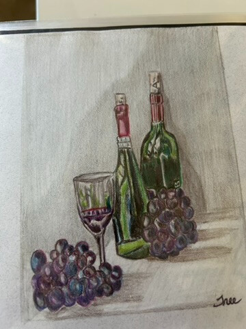
I tried the wine & grapes drawing from the Coloured Pencil course. I think the grapes came out quite poorly, I’m not sure why, Matt’s looked really good in the video.

3 Likes
I think if you make the edges of the grapes, that might help. You have the light values, but the larger values are really there, the bottles and glass has good value though.
2 Likes
Hello Jay,
This is not an easy drawing. Considering that you are just starting I think that you have done a really nice job. Remember that Matt is at a completely different level than we are.
Something Matt often says is that to not look at what you are working on as a whole object, but at sections of value.. this has really helped me.
Also, in these courses I have done the same project more than one time. This has helped me to see improvements and also that no matter how many times that I do it it does not turn out the same.
Keep going, you are on the right track,
Teri
1 Like
I feel that you did an excellent job on both of these
I did the same drawing a few years ago. it wasn’t that easy, and I think you did a fine job! One thing I did notice is that your grapes have a lot more light reflection on them than the original (I’m sure there’s a better way of describing that). I think they look fine, but if you’re dissatisfied, you might try to add a bit more color in some of the white places and see?
Thanks, yes I noticed that too. I just felt they all looked a little flat.
Matt always has made grapes look real! I think it is in his perfect circles!
Hi @jp101
I’d suggest you work on getting the lights even lighter. Specifically on the upper part of the glass and bottles. Overall I think this is quite nice. Just needs a little refinement in the values.
Terri
1 Like