
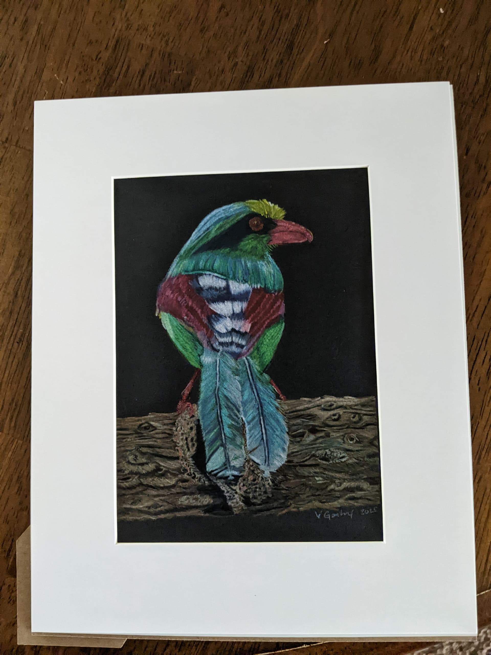
If you are a member on TVI, you can send your artwork to the Critique for Matt to possibly look it over. What I will say I think that you could make the light source more clear, it looks like it comes from the top right, stronger shadows would help with creating better definition. I think the black background looks good, and the tree branch could have more a light source, but I think it works. If you need help with creating more highlights, you can use Gouache on top to do that.
This is is so beautiful!
@Vgentry58 Hello Valery, I would call this done. You did a lovely job and your husband names it perfectly.
I agree with Samuel, If you are a member you should submit it for a critique.
Teri (with 1r)
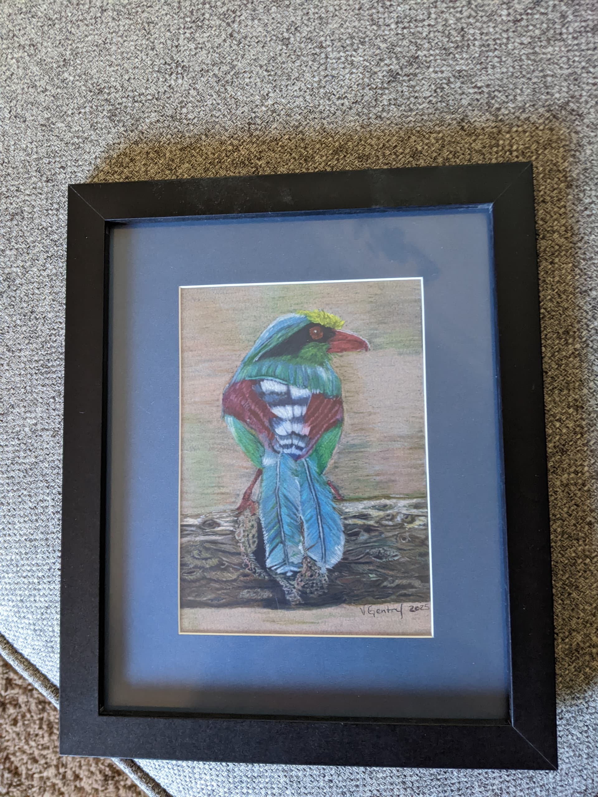
Hello Valery. The changes are very nice and the blue matting works well with the blue.
Personally I like both renditions and think they both are presented nicely. Since I like working on black paper I do have tendencies toward the darker, black paper version. The bird really pops. they both have a different atmosphere.
What is important is which one you like and that it resonates to you.
I look forward to seeing more of your artwork. I don’t get on here much but try to at least once or twice a week so I’ll keep an eye out for future artwork you post.
Teri (with 1r)