
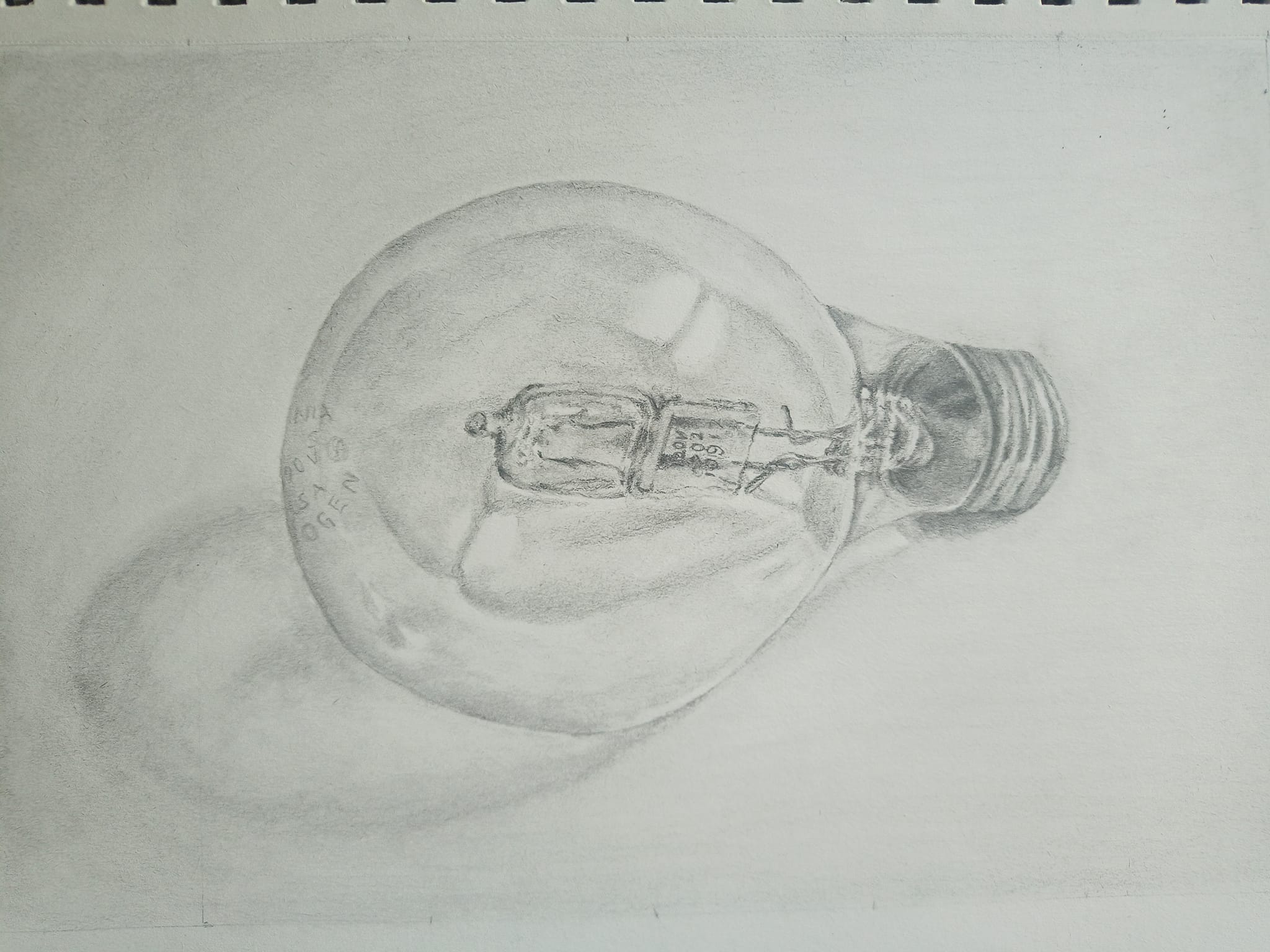
I’m so happy with how this drawing turned out! I actually found this one easier than some other graphite drawings. It must be due to the grey drawing paper! I hope you all enjoy it!

18 Likes
That’s amazing! You really captured its shape and those all-important values!
Looks perfect! The grey paper is a wonderful start when working, far easier to get it dark enough, just going lighter is difficult without white pastels or white ink/gel pen highlights. White charcoal also works well if there isn’t graphite in the area as that makes nothing stick. I like using colors on the grey, sometimes colored pencil details after pastel blocking.
Lovely, the texture of the paper also goes with it nicely! The roundness and reflections of the glass are definitely an amazing “highlight” of the piece(haha…pun) ![]()
That is beautiful. Yes, the toned paper really does help.
Fantastic job! No wonder you are pleased with the result. Takes for sharing.
Patricia.
This amazing! I’m looking forward to trying toned paper soon - you’ve inspired me.
EXCELLENT! Congrats… ![]()
![]()
![]()
![]()
![]()
![]() Really good and the highlights are ‘spot on’.
Really good and the highlights are ‘spot on’.
that looks as if I could pick it up off the page! Highlights are amazing
Dana - This turned out fantastic. Really fantastic!
Teri
wow this is amazing!!! nice work… I love the paper colour and use of white. So So good… the time I attempted a lightbulb I couldn’t get the glass right… but yours is fantastic ![]()

1 Like
That is very wel done ![]()
its on my to do list too, because its trickie ![]()
This is also very ![]() ,
,
i always say with every drawing i make i learn
Wow! That looks great!
Oh my gosh that is amazing I thought it was a real
Blub on paper
Wow!!! I hope one day I will be able to do that!!!
Try it! Before I tried I didn’t think that I could create this. 25 Days to better drawing is the first course that I followed on this site as a member. I had done a few of the Getting Sketchy before becoming a member.
1 Like
Good job! I think 25 Days to Better Drawing is the most logical course to start with on this site. After that, I moved to Colored pencil course. I am so hooked!!!
Brenda
1 Like
Well done, janed. This was not an easy one. I did it a while ago myself. The only thing I’d suggest is to push some of the darks, even darker to get a bigger range of values. If you watch Matt’s weekly critique, he tells us all the time how to improve our range of values. Here is the one I did. TerrI Robichon

1 Like