Thanks Jim @1kidneyJD
My initial instinct was that you could push for a bigger range of values, specifically making some darks darker. I’ll be more specific when I’m at my computer.
Terri
Well done. This project is on my to do list, but I have really dragged my feet in attempting it. So many little details!
Hi James @1kidneyJD
I do think sending this to Matt for the Members Minute is a good idea, as suggested by others. But I will also give you feedback, as requested.
First, I want to say that you did an awesome job with the overall drawing and matching the sizes and placement of the items. It has a more artistic look than the things that I do that are traced. So, well done!!!
Next, I would suggest that you consider getting a set of the Staedtler, Mars Lumograph black pencils. They come in a tin with 6 pencils (1 - 8B, 1- 6B, 2- 4B, 2 - 2B). After discovering these, I ALWAYS use them now for the dark shades in graphite drawings. This is the only way, in my opinion, to get the desired full range of values.
Now I’ll get picky, because that would probably help you the most:
This is a really complex subject matter and one thing I would do to simplify it a little is to not have the door frame on the left edge of the drawing. Draw it like the wall and floor just continued without the door framing and opening. I would deviate from the reference.
Then I think it is important to maintain an understanding of where that line is between the floor and the wall. You have lost that on the left side of the drawing in the really bright area. Make sure it lines up with the much more visible baseboard on the right side of the wall by using a ruler.
Next I would sharpen up the edge of the light reflection on the wall on the left side of the window. It should drop down in a straight line (yours leans in toward the bottom corner of the window) and the spacing should be a little wider than the window frame. That means more wall space before the lines of light appear. I would also try to make that part of the wall darker, if possible.
But the thing that really needs to be darker is the frame of the chair. I see the cat as to focal point, and the dark chair frame would help by visually “framing the cat”. This is where the Mars pencils would help a lot.
Now think a little more about the source of the light, and therefore where the shadows are. The cat is disappearing on your drawing but look how it’s back is clearly defined on the reference. The cat is darker than the wall behind it. The left side of the nose / face needs to be darker, and that side of the cat (especially under the chin) needs to be darker too.
But on the right side of the cat, I would make the cat lighter than the wall behind it for contrast on that side. I would eliminate the white vertical space between the right chair frame and the cat, so the wall is consistent where it surrounds the area behind the cat. The entire wall on the right side needs to be darker so that the contrast is stronger where the edge of the table begins. That’s what you need so that the glass tabletop looks really smooth and shiny.
The bottom left portion of the place matt, and the edge of the surface around it all needs to be darker, because it is in shade. This might be another area where I would have only drawn the place matt, and not the bigger circular area that is under it. That detail in the reference and drawing is kinda confusing, but probably not worth the effort to eliminate at this stage of the drawing. But making it darker you can do.
The chair seat under the glass table on the left should be darker, especially the front edge. So you should see a change in the value from the back of the seat to the really dark front edge, therefore better showing the “form” of the seat cushion.
The little coaster under the glass needs to be darker, so there is high contrast between the coaster and the bright reflection in the bottom of the glass.
You need a darker edge on the chair cushion on the right side of the drawing too. The lines of the texture of the fabric should turn more downward on the front of the seat - again to better follow the soft form of the edge.
Remember that things in the foreground will be more detailed than things in the background. Therefore, I’d add more detail to the placemat in the foreground, and a little less detail in the placemat that is closer to the cat.
I have attached a photo of your drawing next to the reference photo which will better help you see the things I’m talking about.
Sorry this response is so long. I hope it is not too confusing. This is how I personally walk my eyes thru an entire drawing to better refine it. Hope this is helpful.
Terri (w2rs) Robichon
Hi Sonia @Meme5
Job well done my friend. You continue to impress me with your dedication to something you clearly love doing.
Terri w2rs
Terri @robichon First I want you to know how much I appreciate your critique. I must be honest that I was not expecting such a comprehensive evaluation. Just goes to show how much you care about helping others become better at their art. I will spend a few days absorbing all that you taught. I am in need of some art supplies and will add the Mars Lumograph pencils to the list.
Once again thank you.
James from Covina
Wasn’t sure I could post this drawing, but both drawing it and sharing that drawing are part of the healing process. We lost fuzzy one about 2 years ago and I still miss her. I think I may end up framing this one for my son to hang in his room.
Beth (OriNebula)
Hi Beth @OriNebula
A very special drawing indeed. I think artwork is more meaningful when you create it from a piece of your own life, as is clearly the case here. Thanks for sharing this with us.
Terri w2rs
Working one this… Laughing horse…Joy passed away last year and I was ask to draw her as a commission…
I knew Joy… She was a friendly, funny and wise horse.
I am not really sure if more value would give more depth
Looking forward to your critics!
It is 160 gr white drawing paper. Derwent Aquagraphite pencils and just a bit redbrown with watercolor pencils.
Hi Elina.
I think your range of values is looking good on this. Thanks for sharing.
Terri Robichon
@robichon thank you ![]() …
…
5 month ago a friend of mine ask me to draw her horse and her dog for her as a commission ( she ask me to receive a fee…and seriously it makes me a bit proud☺️).
… and I was working on getting a horse on my paper for 4 month now… was not easy… but training helps!
Even the picture were I recognised resestance (the last picture in Matts Watercolor course😅… the result is awful or much to laugh about).
I hope my friend will feel a warm loving laughing feeling when she looks on this!
Maybe I start a second one with Horse Joy🤔
Thank you for the possibility to share my feelings, questions and thoughts with all of you!
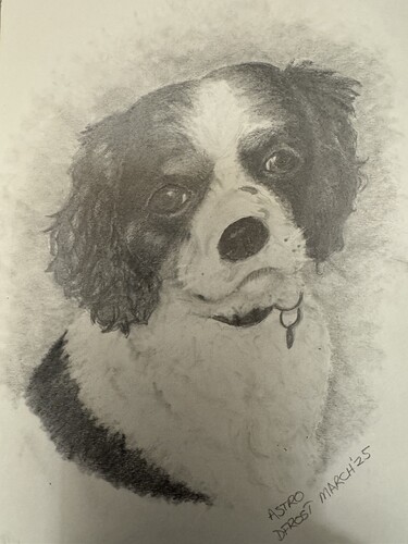
I am working on another dog portrait. This one is going to be in charcoal. Here is my preliminary sketch in graphite.
Hello Debbi @debbi.frost Wonderful, looking forward to seeing your finished drawing.
James from Covina
Looks like a king Charles spaniel… True?
Hi Debbi @debbi.frost
Thanks for sharing your work here on the forum. I think this drawing looks quite good. Looking forward to seeing the charcoal version.
Terri Robichon
Yes, he’s a king charles cavalier spaniel.
These sweety dogs…I got one off them, right now laying next to me… 15 years old …


