Most Recent Drawing or Painting

Hi Twilah @Bearinthegarden
I’m sorry you deleted this post. I glanced at it briefly on my cell phone when you posted, but just now got to my computer so that I could get a better look. I can give you a couple comments based on the image that was on my email notification.

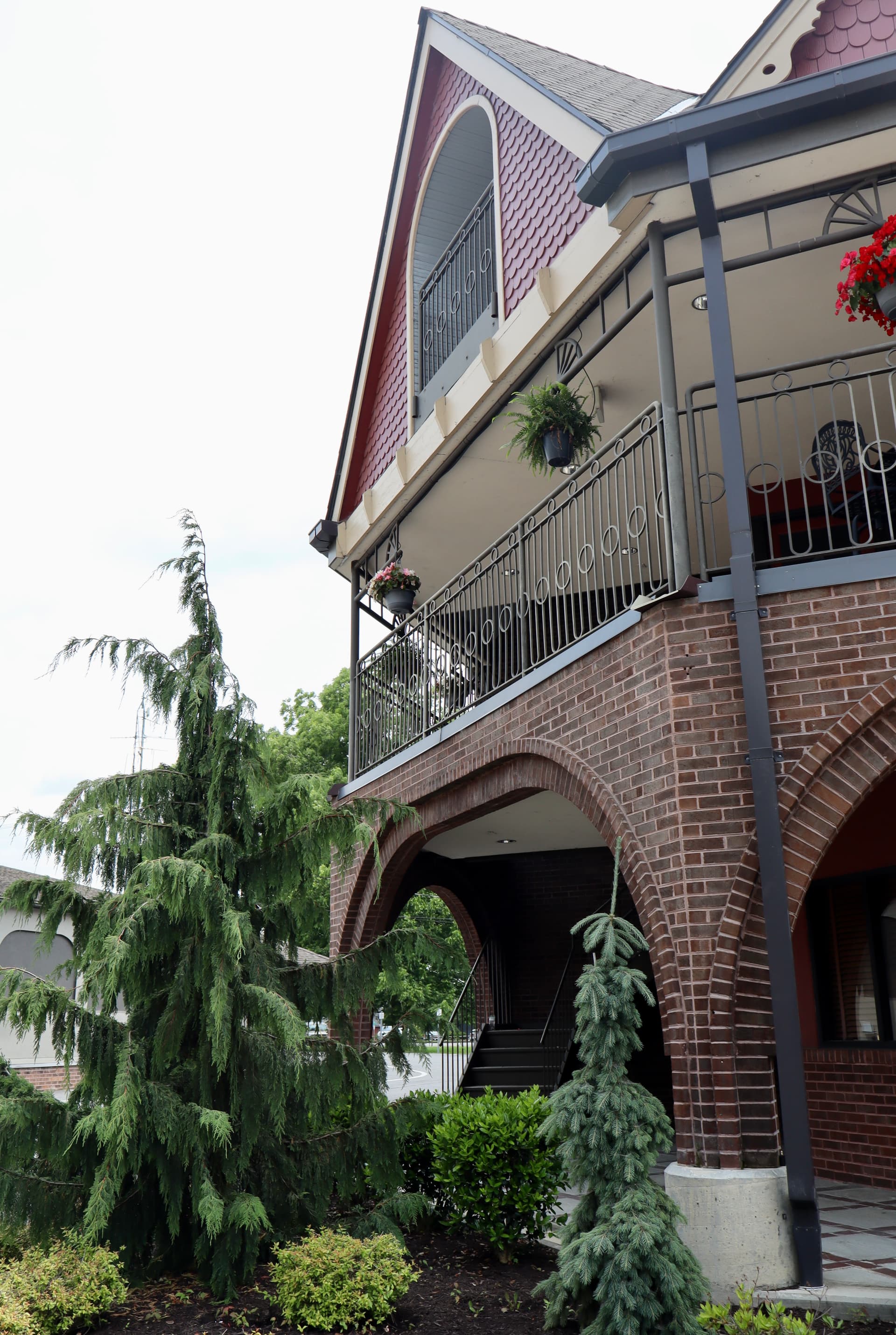
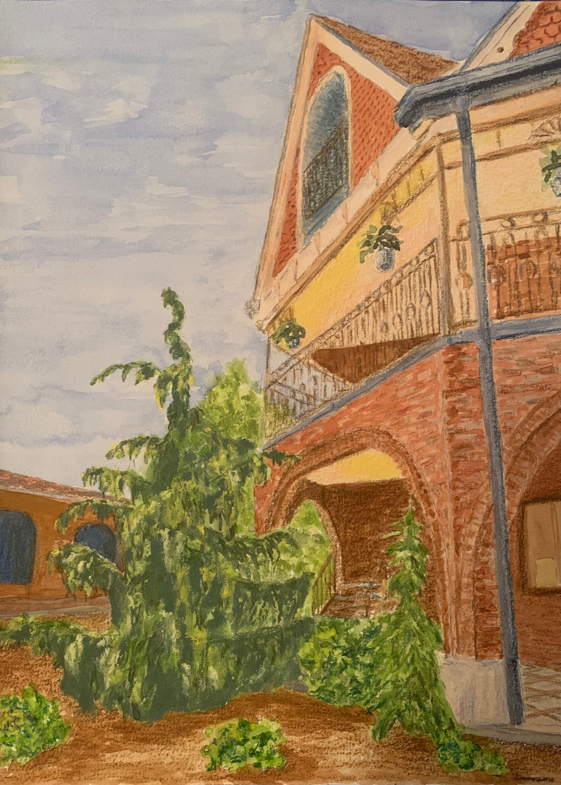
The first thing I looked at was the perspective, since that’s a big deal when buildings are the subject matter. I think you did good with that. Just one reminder to make the verticals straight up and down. For instance, the window on the far left is leaning.

Then I tried to figure out where the light source is coming from, and if that is clear in the value range on your drawing. That’s where I think you could use some work. Both faces of the main building that are in the drawing are pretty much the same value level, and it is more likely that the one to the right should be darker. And inside the building could also be darker.

The other thing that I would suggest is having more variety in the colors. The color of the ground is pretty much the same as the color of the building. I would expect that it would read better if there was some difference. Even the trees would be stronger if the shadows were maybe more of a darker color, and not just green (I’m thinking maybe a Paynes Grey would be great for the shadows and would help to improve the values here too by making them darker).

I hope you don’t mind me commenting on a post you deleted, but we are here to help each other and should never feel bad about posting something we are struggling with.

Terri

Thank you. I deleted it because I thought my question was too lengthy. But I appreciate your response so I’m reposting the pic here, with the edited question of “I’ve been working on this and don’t like it. What improvements can be made?”

Thanks very much for your feedback Terri!

The perspective was an odd thing to deal with because I replicated it from the photo, but the perspective in the photo appeared somewhat distorted because of where I’d stood and how I’d aimed the camera when I took the picture. I’m not a very skilled photographer! :slightly_smiling_face: The window on the far left is actually leaning in the original photo, but I accidentally increased the lean in my art. But you’re right, to make it look consistent I should have ignored the lean in the reference and made the window vertical. I’m including the reference, not because I’m trying to duplicate it exactly, but to show the challenges it presented and the changes I made.

I really appreciate your idea of darkening the trees with gray, thank you. I like having unity with color, so I made the ground the same color intentionally, but you’re right, maybe it isn’t working so well here.

3 Likes

Hi Jan @Creativejan

Sorry for my delay in responding. I can only assist when I’m sitting at my computer (my cell phone just isn’t big enough).

I love watching and painting birds but have found that to do a decent job it’s best to find one reference and stick with it. It makes it easier to understand the structure of the bird and where shadows are likely needed to more accurately represent the FORM / SHAPE of the body.

Since I’m not familiar with this specific bird I went online to look for a possible reference to use in giving you feedback. I will put two good ones here. One is the full body, and the other is the head detail to respond to your question about the beak.


Lets start with the head. The center of the eye needs to be very dark. Look at the head close-up that I posted.

The white patch needs to be more angular at the bottom - look closely and see how it goes from the middle of the head to the throat, and the eye is in the middle of the top edge of the white patch.

Then look at the bill, it is not one flat color, but multiple colors and values. The tip is a dark indigo blue. Then you have a creamy color next to that and white on the right edge and top of the beak. You should also be able to see a lighter line where the bird can open its mouth.

I could do the same analysis of the rest of the body, with shadows under the wings where the bird’s body is, etc.

But now you see why a reference is so important, and that you select one and use it to do a contour drawing before adding any details.

Matt has some really good basic drawing classes at the Virtual Instructor, and you should watch some that show how to do a drawing using the GRID approach.

Jan, I’m so excited that you are here and asking for this kind of advice. We all start sometime, and we have to start before we can figure out what we need to do to improve. I sure hope this is helpful, and that you will continue to draw, post, and ask questions.

Terri Robichon

4 Likes

Hi @Bearinthegarden

It’s so much easier to help with your question when I can see your reference. Look at how very dark the inside of that building is.

I think one of the main things you could work on is VALUE. To do that you should watch several of the Member Minutes that Matt posts every week. It will help you see where things need to be lighter, where things need to be darker, and then having a full range of mid-tones.

Keep drawing my friend. I’m so glad you reposted the reference and your artwork because others here can also learn from these interactions.

Terri Robichon

3 Likes

Hi Jan,
Thank you so much! :eagle::yellow_heart: Painting on wood was such a fun experience! I used Daniel Smith watercolor ground to prep the surface first; it gives the wood a texture that grabs the paint similar to cold press paper. Using the watercolor ground is key, otherwise the watercolor tends to spread into spider-like blotches. I usually give the wood 2 thin coats of watercolor ground letting it dry completely in between coats. It takes a little getting used to, but I love how vibrant the colors stay. If you were gifted some wood panels, definitely give it a try! I’d love to hear how it goes!

Jess

1 Like

Hi there Terri!

It’s so great connecting with another watercolor artist! :blush: Arches 300# hot press is one of my favorites too—along with the cold press, it’s pretty much my go-to for everything watercolor. I love the way it holds up to layers and detail. I’m really enjoying being part of the forum and look forward to seeing more of your work too!

Also, I just wanted to say—I’ve really noticed how generous and encouraging you are around the forum. Your thoughtful feedback and kindness really stand out and mean a lot, especially to someone like me who’s just settling in. Thank you for taking the time to share your insight and support with all of us. It’s truly appreciated! :yellow_heart:

Jess

1 Like

Thank you I appreciate the feed back I will try and work on the ideas you gave me

1 Like

Hi Terri ,
I agree it is hard to see things on a phone . Thank you for the great reference photos . And the ideas especially around the beak and head area of the macaw . I would greatly appreciate the feed back for the body as well . Thank you Jan

1 Like

Hi @Creativejan -

You asked for more advice about the body. So what I did was take your drawing and put it in photoshop, adjusting it for the 24 x 36 size that you said your canvas is.

Next I took that reference photo which is the closest I found to your work, I removed the background, and then adjusted the size to match the scale of your birds head, as closely as possible.

I have then put those two images (my suggested reference, and your current painting) side by side. Here it is.

Based on this comparison, I’m going to make a recommendation that you probably won’t like. You can try to refine your painting all day long, but it will always look off, because your base drawing does not match what that birds head and body actually look like.

I think you are getting ahead of yourself with this project because you need to start this artistic journey by first learning how to draw shapes, using a reference photo and probably the “grid method”. Matt has a ton of lessons that teach this. Therefore, I’ve added grids to the drawing comparison for you.

The thing about Acrylic paintings is that you can paint over them and start again. To be brutely honest, I think you will grow the most as an artist if you stop and watch a couple lessons. And then you can start this one again by getting a line drawing on the canvas that is more proportionately accurate.

After that, what you should focus on is understanding “value” - the lightness and darkness of colors. When looking at the reference photo, look for where the shadows are. These need to be darker. Then look for the lightest areas like the top of the birds head, these need to be your lightest colors. Then the mid-tones area between those.

Matt has a member benefit called the Members Minute. They are less than a half an hour long, and a new one is posted every week. Watch some of those. It’s what I do every week. He talks about VALUE all the time. It’s something all artists of all skill levels always need to be thinking about.

Hope this is helpful. Please keep posting.

Terri Robichon

3 Likes

That is a Scarlet Macaw Terri, and a very beautiful one at that. Perfect subject matter.

1 Like

@Creativejan

Terri has given you great advice. Don’t get discouraged! We are all here to help each other. I also just wanted to add to Terri’s advice-in the course 25 days to better drawing there is a lesson explaining the grid method.

Without a strong drawing you can paint all day, and something will always be off.

I would also recommend doing smaller drawings not necessarily 24x36 until you become more comfortable with the method itself. Personally, I started with basic objects like bananas, apples, coffee cups, lamps etc. drawing them using the grid method. Still-life’s are also great practice. Humans and animals can be a little more challenging since there is anatomy involved and those tiny little subtle value changes can be tricky to see, however make a world of difference.

Keep at it and we would love to see how you are progressing.
Jess

link to the lesson-
25 Days to Better Drawings – Day Twenty-One – The Grid Technique

3 Likes

Hi Jess ,
Yes I agree Terri gave me some great advice and I have been taking lessons on VTI for basic drawing with Matt . They are helping . I don’t get discouraged hardly ever I just reboot and start again . I do all size drawings and paintings and I can draw pretty easy already on smaller canvases . I am definitely no Van Gogh or Vinci :rofl::rofl::grin: by any means and I am loving the suggestions and the input . It is helping me . I agree this is an awesome group and I love all the great suggestions and feedback that is why I reached out for help . I am not working in the parrot again yet I am on a trip so I couldn’t bring something that big . So when I start on it again in a few days I will show my progress and hope to get more suggestions . Thank you Jan
Here is a littler one I have made this was on a small fabric banner .

2 Likes


Here are the 5 eyes in pen.

6 Likes

Hi Jan,

Thank you so much for your lovely message! I really admire your attitude, being able to reboot and keep going without getting discouraged is such a great mindset to have, especially in the creative journey. :blush:

It’s wonderful to hear that the TVI lessons with Matt are helping and that you’re finding support and encouragement from the group, I feel the same way! It’s such a welcoming and generous community, and it’s inspiring to see how we’re all learning and growing together.

Your fabric banner piece is so creative. I love seeing how you explore different materials and sizes! I’m looking forward to seeing your progress on the parrot when you return to it. Safe travels, and thanks again for sharing your work💛

Warmly,
Jessica

2 Likes

Hi Susan! :waving_hand:
These eyes look amazing! I love how expressive and unique each one is! You’ve captured such great detail and variation. :fountain_pen::sparkles:

I’m curious, what lesson is this from? I’d love to check it out — looks like a fun and challenging exercise! :blush:

Jess

1 Like

Those are amazing I love the detail in the eyes and the surrounding area . Are you going to make them in to something or were you just practicing ?

Thanks Jessica.
A Wednesday Virtual Instructor lesson. Le me see if I can locate it again. If so I’ll forward it to you.

Namaste,
Susan
Www.susansarabasha.com

I was just doing the exercises as I’m trying to get better with ink.

Namaste,
Susan
Www.susansarabasha.com


Project eagle, small drawing paper, mechanical graphite pencil.
First oil pastel start of the picture in Matt’s oil pastel course. Sketching paper, Giorgione oil pastels.
And my human eye training. I got my big mistake fixed! I drew the lid below dark before😅.

5 Likes

Hi @trevowen Trevor, while scrolling today, I saw your portrait. Without having scrolled down to your explanation about who it is, I thought: yeah, a great sketch of the younger Trevor.

And here you are: your son!

You did great,
Buddy

1 Like