
The colors and marks come together to support a sense of calm. Very nice.
1 Like
The Image Is Really Nice, Was This The Bear That Gave Your Internet Name?
Thanks. Yep, it and a live bear in my neighborhood inspired my name.
1 Like

So, drawing humans is not my thing (yet) - but I wanted to try the combination of pastels and colour pencils. I figured this pic of Arwen was just right one for trying that out. It’s on hot pressed water colour paper.
10 Likes
1 Like
As a big lord of the rings fan, I really like. I think you captured her face really well, and that’s hard with a real person. Good work.
Really detailed Samuel…good to see this!
Your friend in Live Classes!
1 Like
Wow This is amazing Siffermus! I love it all the gentle nose, the expressive eyes, the mouth expression…the colors are superb too! Way to go!
Therese
I’m Glad You Enjoyed The Artwork, I do feel like Something Is Missing with It, but I can’t put on figure on it.
I love your shuttle! You remind me of how I got my first Copics, it was also after the pineapple with Ashley. They were also on discount and I loved them so much I eventually bought the gray scale set, and that very next lesson was the Scotch tape dispenser. Makes me realize how much I have learned from TVI. Glad to see your finished piece, I love how ominous the vapor looks. Excellent drawing, as always.
2 Likes

I painted this sitting in the back yard yesterday. Watercolor on Arches cold press 9x11. It was a wonderful Saturday, well-spent and I was fortunate to have a day cleared for it. I did spend the whole day on it, about 7 hours. The perspective is not great, I’m aware.
6 Likes
Hi Lisa @HarleysMom
I admire anyone who can sit outside and create artwork. Well done and thanks for inspiring all of us.
Terri
3 Likes
Hi Lisa, @HarleysMom
Ohhh I too love “arting” outside while soaking up the sun. Your painting makes me so happy!
Perspective is tricky it has it rules however the best practice is just to do it, the more you do it the better you will understand it. Knowing your viewpoint/horizon line and where everything is converging to is key to understanding perspective. I found it helpful to use a plastic report cover over photos and trace the converging lines back to where they meet. Our eyes and brain love to play tricks on us in the way we see things.
Great job-
Jess
2 Likes

Just an update on the macaw . This is the changes I have made and I am pretty happy with it . For now . Thank you for all the support and help
4 Likes
Hi Terri thank you for all the input on my macaw . This is how I have fixed it . I think for right now I am pretty happy with it . I really appreciate all the feed back . And the input to help correct it . I will keep working with Matt’s classes to get better .

4 Likes
Hey thanks very sketchy much like life at the moment
The texture of the paper adds an interesting element, it has a simple look to it, it’s a sketchy piece and there is charm In that. What probably make it difficult was doing on location, fighting the changes in the sun and where shadows are reflections were going to be. I really enjoyed the artwork.
2 Likes
Is it wrong to call this illustrative? In a Tolkien book:) m
Hi @4Margaret
This watercolor pencil drawing looking up to the treetop is a YouTube lesson I saw at a site called “Painting and Chocolate” where she did this same drawing multiple times to compare various brands of watercolor pencils. Everything I do is pretty much what I would call realism, so the terms you used have no meaning to me. Sorry.
Terri

5x7 drawing on Sennelier Oil Pastel paper, using Mont Marte - Watersoluble Oil Pastels. Truth be told, this is my least favorite media, and this was my 3rd try at this drawing. As I’ve said before, it’s like drawing with lipstick.
Let me tell you about my failures. The first was an aweful choice of paper. It was a toned illustration board. Too much texture and the white oil pastel couldn’t cover the color of the toned surface. I didn’t want to fight this bad decision so I started again.
I remembered I had an “Oil Pastel Pad” by Sennelier (white) and this was GREAT. It was my second try and I didn’t spend as much time with my contour drawing. When I got to the rocks, I was completely lost and was struggling once again. I decided to take a different approach.
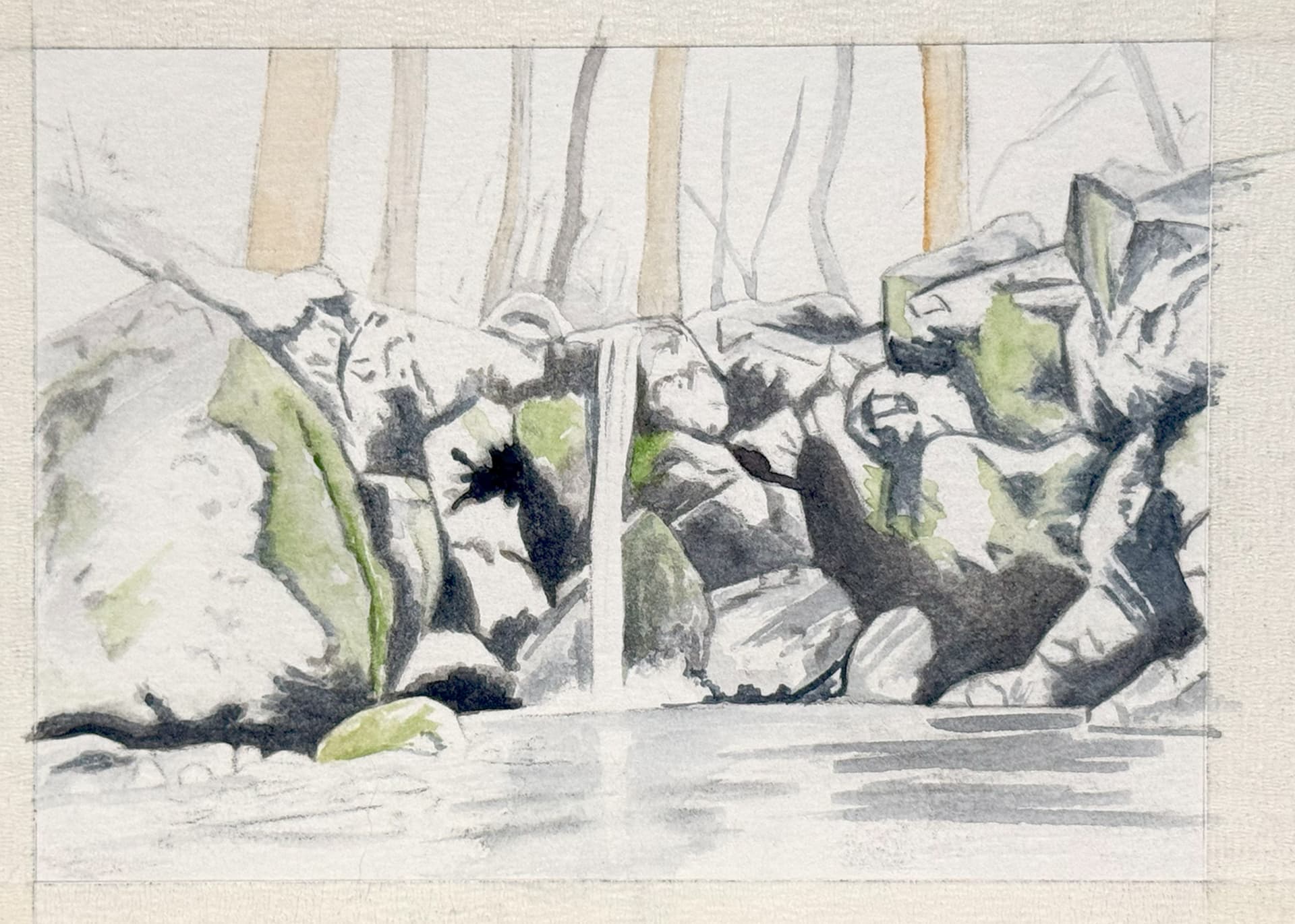
The third time I stayed with the oil pastel paper. The difference is that I took more time with the initial drawing, and then I did a watercolor underpainting so that I could clearly see where all the rocks were, including the areas of shadow. The oil pastels completely covered this preliminary painting, but the mapping of shapes was what I needed.
By the way, those Mont Marte watersoluble oil pastels were something new that I was trying. A set of 48 from Amazon was just $17 and they worked well.
Here is that underpainting, before any oil pastel was used.
Terri Robichon
6 Likes