

Realism portrait.
Took me 10 hours and cuz I didn’t knew any better I made this one 95 gram, grainy paper.
Just recently started drawing so have lots to learn.
I’ll be using 250gram smooth paper for these types of drawing in the future.
10 Likes
This is incredible! I can’t believe you’ve just started drawing! Have you been doing other art for sometime?
1 Like
No not really, I liked to draw as a kid a lot, but I never did anything with it. I didn’t do anything for like 15 years. Have my normal job and everything… then I got covid… long covid… 14 months now stuck in bed trying to get better. Then I thought, I wanna start drawing again. Bought all my stuff 4-5 weeks ago and start watching drawing videos on YouTube. I did 2 drawings before this one. An ink drawing of a old shed and my first try at realism, an eye.
That’s why I take the yearly subscription here cuz there’s so much to learn for me here.
And thanks for your comment! Appreciate that!
1 Like
Hi @SlippyPaints! Welcome to The Virtual Instructor Forums! Your portrait is AMAZING! The water looks incredible! Keep it up! Jesus loves you!!!
1 Like
Glenn,
This is gorgeous! And the water does look so real. You should definitely submit it for Matt to critique.
I am so sorry to hear you have Covid. I have now had chronic neurological lyme disease for 9 years. Art just came to me when I got sick. Now I really enjoy learning.
Hope you are up and feeling better soon.
Teri
1 Like
Hi Teri,
Thank you so much for the response ![]() really appreciate that! I think I did sent it too him but found out later I sent him “a wrong picture” I mean, it’s the same drawing but a print screen from my photo album… so u can see my battery level and everything
really appreciate that! I think I did sent it too him but found out later I sent him “a wrong picture” I mean, it’s the same drawing but a print screen from my photo album… so u can see my battery level and everything ![]()
He mailed me back saying it was awesome so I don’t think I need to sent him the same picture again, without it being a print screen…
i made a post on the forum about this drawing, how I did it, my mistakes and everything, with step by step pictures. I saw u sent another message so imma go there and reply again!
Thanks again ![]()
-SlippyPaints ![]()
1 Like
Patricia.
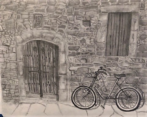
I have decided that I will go with your first suggestion. My idea of children playing with kites and the bike made too many focal points and looked cluttered. Here is a very. very rough draft in graphite. I am thinking of drawing the wall in pen and ink but using sepia and enhancing with similar colors of ink or watercolor washes and then drawing the bike with black (first masking out the white and blue parts of the bike and then making the bike a brilliant blue.
I did this drawing by spreading graphite powder then reverse drawing in with an eraser and adding highlights and shadows with graphite pencils. It is obvious it is a quick drawing of the details but wanted to see if this is something you had imagined.
Anyway, suggestions before the actual drawing would be welcome.
Thanks, Teri
OOPS! forgot to upload the drawing!
9 Likes
I like the idea. It isn’t really what I had imagined (I was thinking was more of a brilliant white wall (like Greek houses) with either a rusted bicycle or a colorful one)… but I like where you are going with this. I think it will be fun subject in pen and ink. Have fun!
1 Like
I looked up white walls in Greece and now see what you mean. I like that better. Will see if I can work something up and compare the two ideas.
Thanks again for your help.
Teri
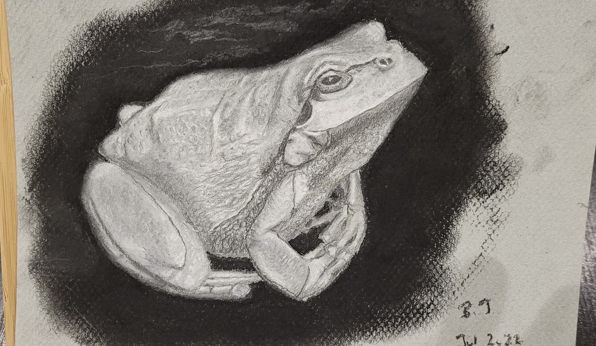
I have just finished having a go at drawing this green tree frog. It’s the first time I’ve managed to put together a freehand image. I’ve used blue-grey Mi-Teintes pastel paper, working mainly with white charcoal and B and HB pencils. The biggest mistake I made (I think) was putting a charcoal background around the frog - I should have used a 4B pencil instead. The charcoal made the frog too light. Would love to know your thoughts
5 Likes
@SlippyPaints Love the drawing. The detail is amazing!! Though there is a bit of grain from the paper in the drawing, it adds to the texture of the skin.
1 Like
Honestly, I like the charcoal background. It does make the frog very light but maybe that’s fixable with some darker shades here and there. Like the underbelly of the frog. (Making a little more contrast on the frog.) But keep the frog standing out from the background at the same time.
They always told me to not be afraid to go dark where it should be dark ![]()
I don’t wanna go too deep into giving tips as I’m not experienced enough for that but that’s just what I’m thinking. Either way, I love the drawing!
Keep it up ![]()
-SlippyPaints ![]()
1 Like
Thanks for the tips @SlippyPaints I’ll look at it again this week and see what I can do. The values to need to balance out a bit more. ![]()
Practice will only help us all ![]()
1 Like
I think that the dark charcoal background creates some interesting negative space! Also, it makes it seems like there’s a spot light shining on the frog in the scene! Let me try to illustrate what I mean? Let me know if it doesn’t make sense and I’ll try to clarify!

1 Like
Thanks, that does help. I went back to the reference photo - the frog was on black material. I should have spent some more time with the nuances there as the material the frog was sitting on has some subtle highlights. I guess I was in too much of a rush to finish this drawing. ![]()
Note to self - take some time to do it all properly!! ![]()
1 Like
I don’t know how many of you recognise this person, but this is my childhood graphite portrait of Jeremy Brett, a very well-known actor from the UK who played the role of Sherlock Holmes. I think I was in my teens when I first knew about the Japanese-dubbed version of the Granada TV’s “The adventure of Sherlock Holmes”. I was already a huge fan of the original novels back then, so I got immediately hooked on this TV series. I drew this piece pausing the VHS video I used to record the drama. I think this is one of the few graphite drawings I’ve done so far; a very, very old one. I would love to watch that series all over again!

6 Likes
Whoa! So, you use graphite too @Maki ! ![]() Really nice shading!
Really nice shading! ![]()
1 Like
Thank you, but it is a long, long, loooooooooooooooong time ago! ![]()
That said, I don’t find much difference between ballpoint pen drawings and graphite drawings, particularly because I use a ballpoint pen which can draw grey lines. I will keep working on ballpoint pen drawings for some time, at least until I complete my animated films using the medium. ![]()
![]()
![]()
1 Like
Maki,
Looks like a photograph back when there were only black and white. I see that you had a great foundation for ballpoint pens by your drawing abilities. Wonderful job as always.
Teri
2 Likes